

We live in times where internet is responsible for running our lives. We have most certainly shifted all of our focus towards it for each and everything and this has resulted us relying for the most basic things on the internet as well as grocery shopping. This surely has brought about a new era for us and looking at the internet usage of the consumer almost every industry has their site running over the internet.
With the development of smart phones, the internet access through the cellular device has become an easy task and hence it is important to understand that the internet usage over the computers and laptops has shifted towards cell phones and tablets. This change is something you should very well account for while making your website.
Why the change should be accounted?
The change surely has to be accounted, since a cell phone screen is pretty small as compared to a laptop or a computer screen and accounting for the whole website to be viewed properly on it is not possible. It might just even happen that if you use flash, the site might not be visible on a few devices. This unease in the site view over cellular devices has been just trouble for people.
How to make your website mobile friendly?
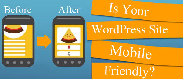 Making your website mobile friendly is very important to be considered these days since most of the people, because of its vast applications, have started using cell phones extensively. Mentioned below, are the tips you could keep in mind before making a website to make it mobile friendly.
-
Keep navigation easy and simple
You need to understand, when someone is browsing on their cell phone, the screen size in front of them is not going to exceed 6 inches and while that might be a lot, most of the phones are between 4’5-5 inches. A site with a complicated structure with a lot of complicated links are not going to work out on a cell phone. Make sure that your website has a simple and easy navigation.
-
Include Location and contact details
Make sure that the location and contact details are visible and the viewer does not find the need to scroll more to get these details. Reason being, if a person over a cell phone cannot find himself in your contact details, he might just move on to another site and contact another agency for his work. This might be a small point but making sure of this small point goes a long way.
-
Ensure seamless integration
Though the desktop version and the mobile version might have differences, they should sync perfectly with one another. If an item was added to a cart on the desktop site, the mobile site should be updated on this instantly. This would help the person to shift his work device according to the situations and thus this would ensure a hassle free work for him.
-
Focus on speed
Your website data should not be too much. The reason behind for loading time if a website takes more time, then the user loses his or her interest in the site and moves along to the next one. The site should be appropriately sized according to the relevant data to be displayed on the site.
-
Avoid Flash
A lot of websites do not have flash installed. So they cannot view a few sites. Make sure your website does not require flash to work else you might lose potential viewers on your site.


Thanks for sharing this article, Good and impressive. Google gives prioritizes mobile-friendly websites over those that are not mobile-friendly in mobile search results so its needed if you have any website.